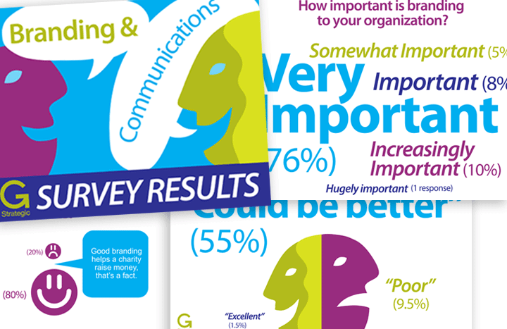
Free Branding Survey Infographic!
About a year ago (when G Strategic was just a little sprout) I asked Executive Directors, Communications Managers and Directors of Development in the not for profit sector to participate in an in-depth discussion of their branding and communications needs and practices. I surveyed local, provincial, and national organizations in the social services, healthcare, educational, environmental, and arts and culture sectors. The executives and senior managers who were able to generously grant me interviews provided many very thought-provoking insights into the challenges and rewards of using branding, communications and design to express their organizational values and vision to a variety of stakeholder audiences, and in advancing their mission. I think the intelligence gathered in this survey is as relevant today as it was then, if not more so. So, seeing as the recent trend to synthesize and visualize data in infographic form has really taken off, I decided to transform the anonymous survey results into one and share it with you.
What this trend is really about, I think, is that we are all so bombarded by a constant stream of facts that having information transformed into colourful and compelling (even entertaining) visuals not only makes them more likely to be read and perhaps saved or archived, but also makes the info easier to understand, remember, and share.
If you have data that you think would be more impactful as an infographic, I’d love to hear from you!
Click below to download, and enjoy!

